Generating an Expression Sheet
So after following the steps to get a base character design that we’re happy with, it’s now time to turn that into a expression sheet! So that we can use it for the future variations and poses we want to create.
What is an Expression Sheet?
An expression sheet is a sheet of drawings of your character, showing the different expressions they can make. This is a great way to get a feel for your character, and to see how they look when they’re happy, sad, angry, etc. It also happens to be a great way to give Midjourney a bunch of references for how your character should look like, going forward.
See the hero image above for an example of an expression sheet.
Let’s create one now!
For demonstration purposes I will use the character called “April” that I created in the previous step. I’m choosing her because she has some pretty unique features and I like her aesthetic! But after the walkthrough, I will demonstrate the character sheets for all the characters I’ve shown in the previous step.
Step 1: Collect your references
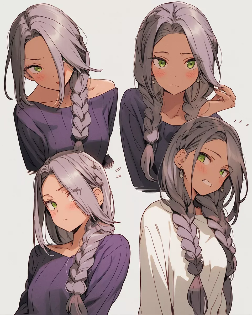
So providing you followed along so far, you should have either a single base reference sheet, or a couple of similar styles which you like. These will be the base for our image-prompt. Here’s my references from the previos step:
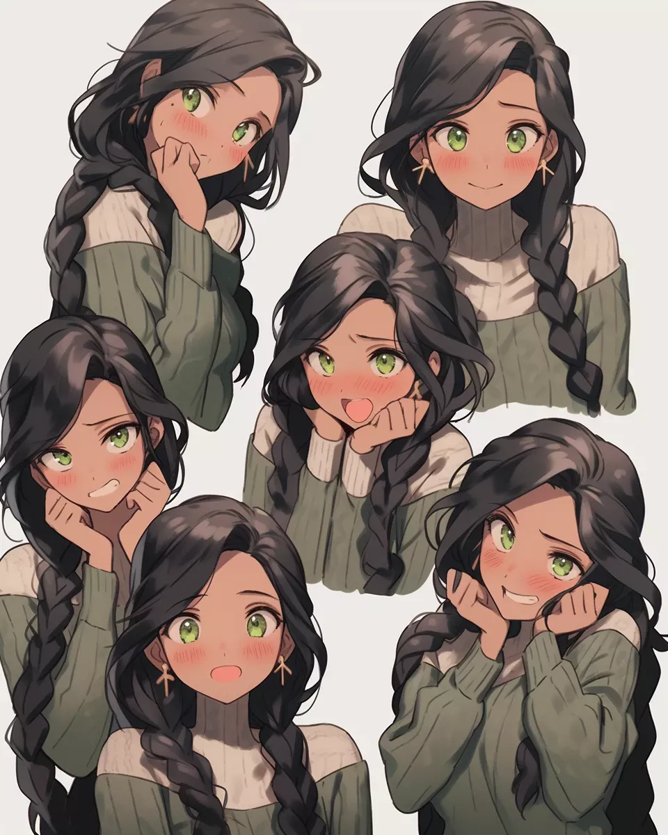
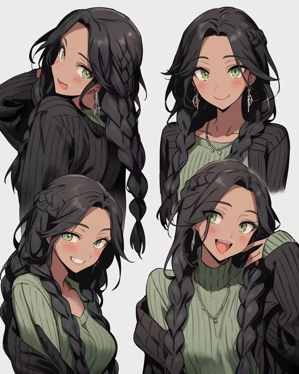
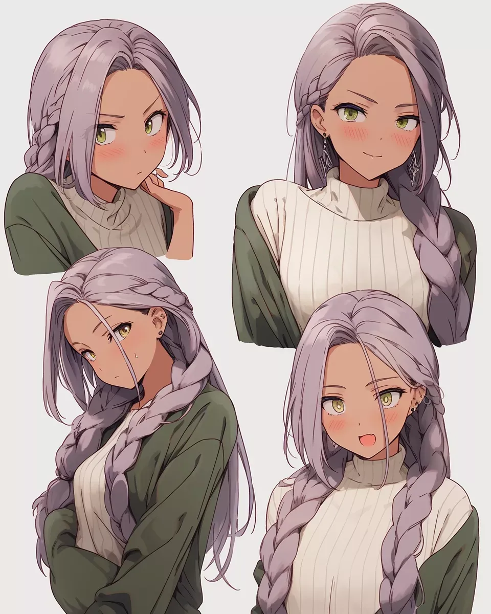
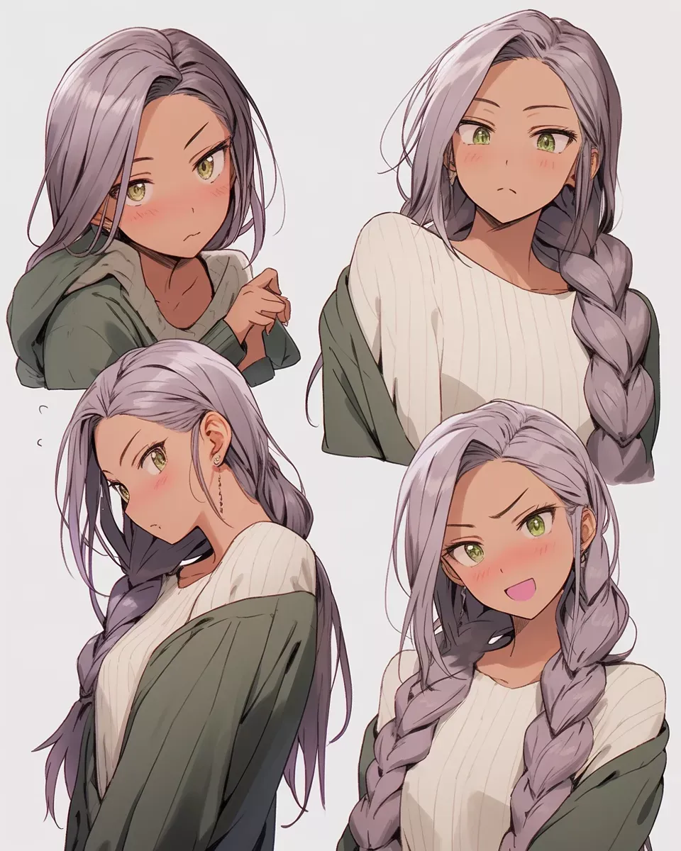
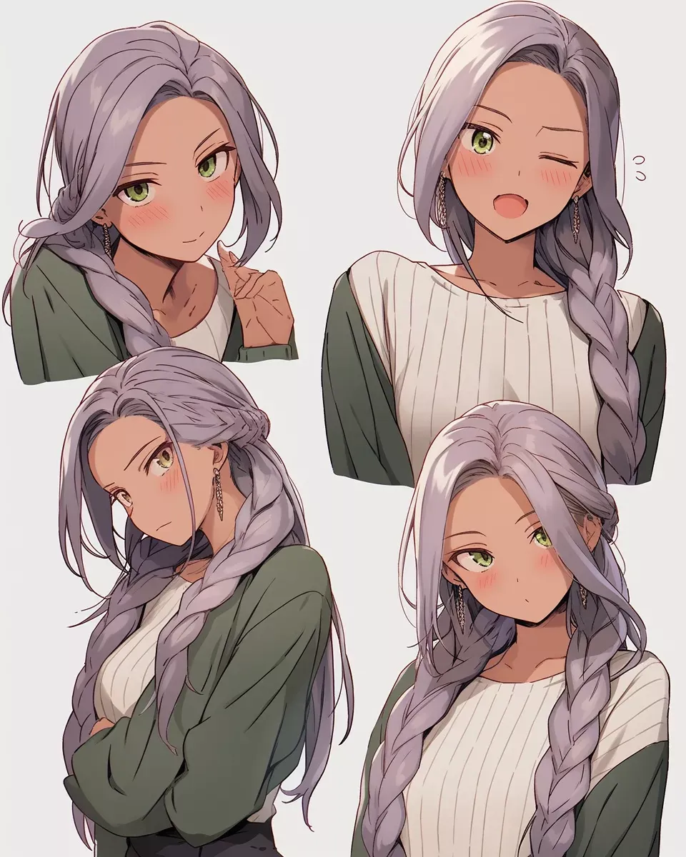
And, although these were all I showed before, I actually wanted to try out some more variations to see if I can get more of a pink/grey hair color, and also to see how she looks with a different hairstyle. So I created these additional references:
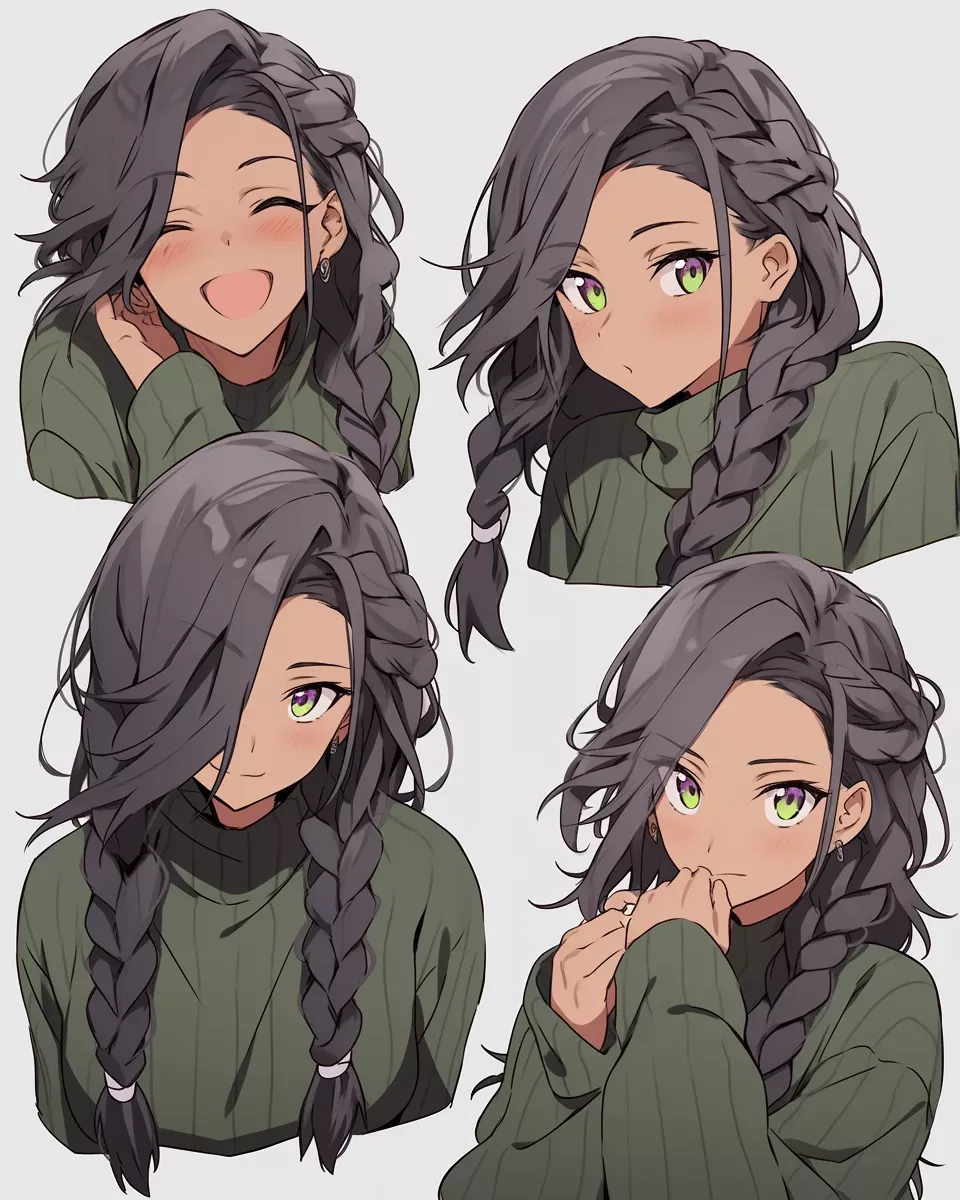
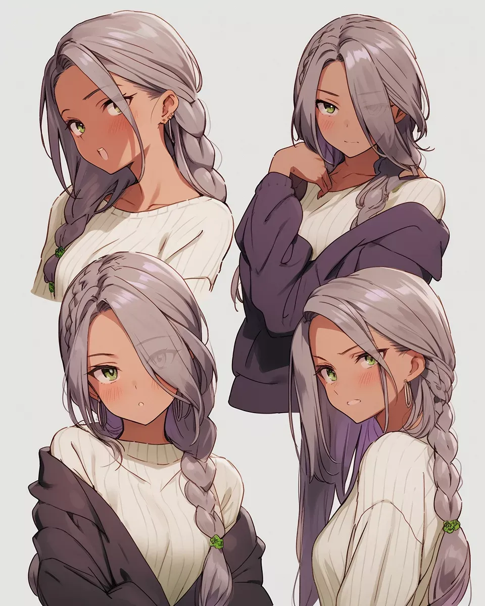
Time to build a prompt!
Now that we have these references, we will build upon the prompt we created in the previous step to turn it into a prompt that will generate an expression sheet for us.
/imagine prompt: [reference1.png] [reference2.png]
grid layout, 3x2, character expression sheet,
different expressions
[original prompt]
--ar 6:5
which, when considering our April character, looks like;
/imagine prompt: https://s.mj.run/M6hbb1YEafU https://s.mj.run/EEhlLxBbg-0
grid layout, 3x2, character expression sheet,
different expressions
beautiful 26yo girl with bright green eyes,
dark tanned skin, long purple gradient hair, chunky braid hairstyle ,
wearing a green sweater, in the style of miss nagatoro anime,
isolated on a grey background, different expressions --s 40 --niji
--ar 6:5
Let’s dig into the different parts, here.
[reference1.png] [reference2.png]
These are the references we want to use for our prompt. You can use as many as you want, but I recommend keeping it to 2-3.
Image Reference Notes
It’s important not to put any commas between or after the image references, as that will break the prompt. You can learn more about “image prompts” here.
-
grid layout
This is the first part of defining our expression sheet. We tell Midjourney that we want the resulting image to be in a grid. This helps to prevent the chaotic, random layouts that we were getting with the reference sheets. -
3x2
Next we want to try and control the size of the grid. We do this by specifying the number of rows and columns we want. In this case, we want 3 rows and 2 columns.
Grid Layout Notes
Supplying grid layout, 3x2 will not guarantee that the resulting image will be
exactly 3x2, but it will help guide Midjourney most of the time. As with all generations, it
may take multiple tries to get it right.
-
character expression sheet
This is the main element. This will tell Midjourney to follow the format of an expression sheet; meaning multiple poses/expressions of the same character. -
different expressions
Combined with thecharacter expression sheetprompt, this just gives a little extra help to make sure we are getting multiple expressions instead of a single image repeated 6 times. It’s not totally necessary, but it occasionally helps. -
[original prompt]
This is the prompt we created in the previous step. We want to include this so that Midjourney will consider the original description when referencing our character reference sheets. Make sure to include the original parameters, too, like--s 40 --niji. This is important to keep the image looking the same style. -
--ar 6:5
And finally, we will change the aspect ratio to a Landscape format. Expression sheets in a 3x2 grid are what I’ve found to be easiest to expand upon, and Midjourney is more happy to create that layout with a landscape aspect ratio.
Enough explaining, let’s see what we get!
/imagine prompt: https://s.mj.run/M6hbb1YEafU https://s.mj.run/EEhlLxBbg-0
grid layout, 3x2, character expression sheet,
different expressions
beautiful 26yo girl with bright green eyes,
dark tanned skin, long purple gradient hair, chunky braid hairstyle ,
wearing a green sweater, in the style of miss nagatoro anime,
isolated on a grey background, different expressions --s 40 --niji
--ar 6:5
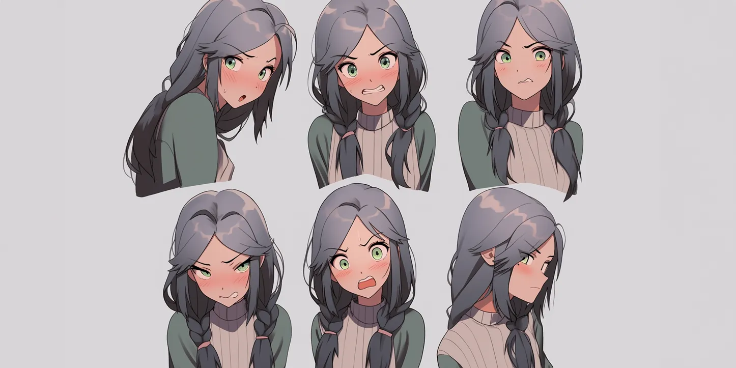
First returned result;
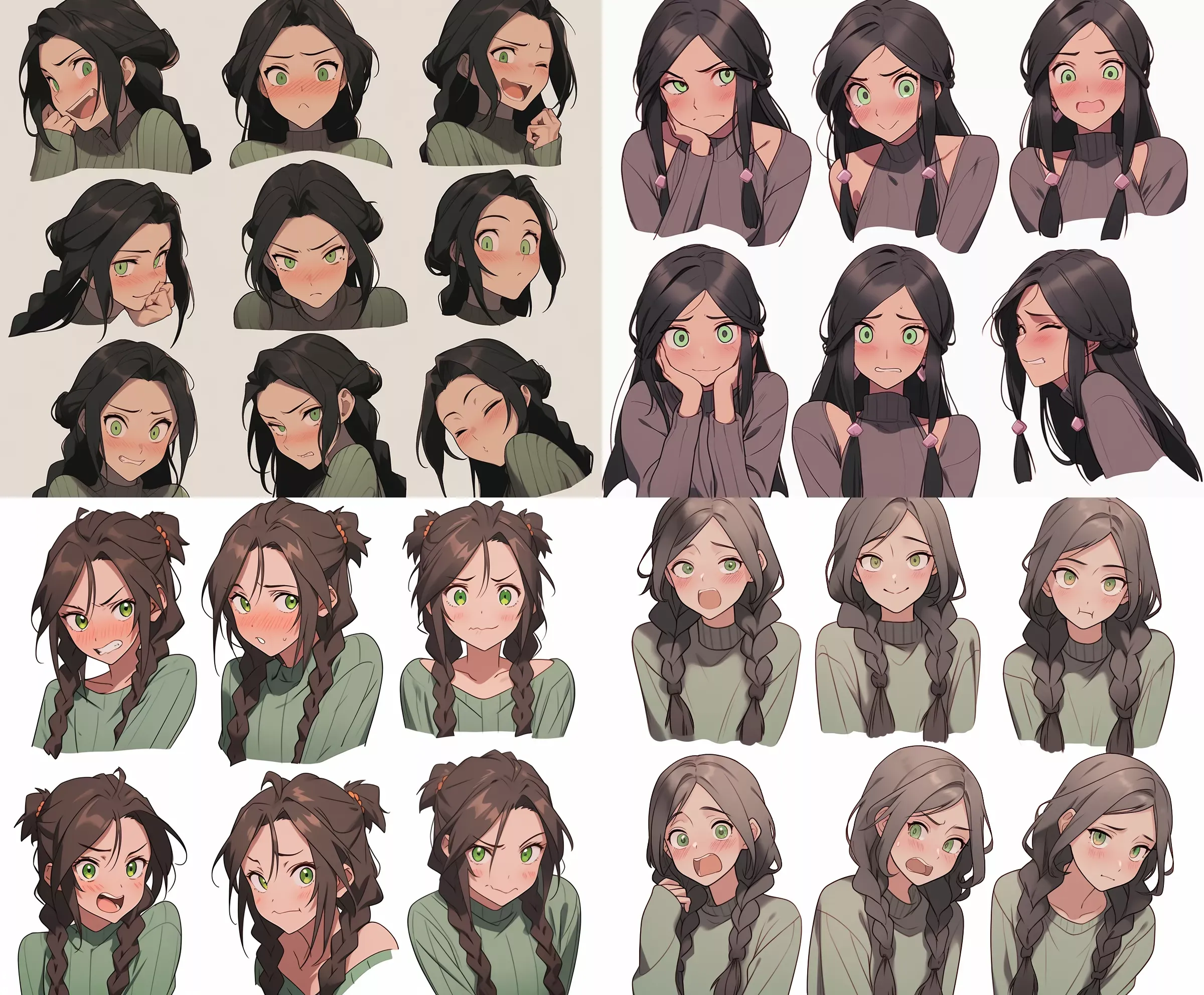
Now this is not bad at all!
So let’s explain a couple of things here.
Objective;
- 🔴 Firstly the image is a 3x3 grid, which is not what we’re looking for.
This is a good example to show why we dont want 3x3.
The 3x3 has much less clothing and upper-body expression on show. This limits our ability to pose hands, shoulders and accessories. Also long hair that drapes over the shoulders is cut off. This is why it’s preferred to use a 3x2 grid.
- ✅ Secondly, notice how varied the expressions are in the other images?
There’s a range of emotions and postures. Some side-on, some front-on. Some with hands, some without. This is exactly what we want to see in an expression sheet. It gives us a lot of options for later when we want to manipulate the expressions.
- 🔶 Some heads are cut off at the top, don’t worry; we will fix that later.
- ✅ The backgrounds are mostly a mid-tone grey!
Subjective;
- 🔴 The hair color is not what the gray/pink color I hoped for.
- ✅ The hair style is cute! Lots of chunky braids.
- ✅ We’re getting nice sweater details and it’s a good shape.
- 🔶 The skin color is not quite as tan as I was hoping for.
- 🔶 I’m not totally fond of these eyes.
So based on my subjective notes, I have two options.
-
1a: I can use a different set of references to try and get a better result. -
1b: I can choose one of these images, and try to replace the eyes with something I like better.
1a: I want it closer to my reference!
So if we feel that the reference images are not producing the kind of character we are looking for, we can go back and choose a reference we liked, and produce a few “subtle” variations of that reference. Then use only the variations as the reference. We can provide more, too, to overpower the image weighting.
I really liked this one;
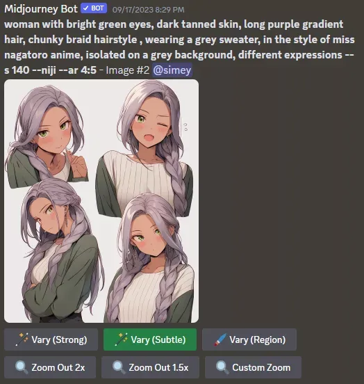
So I will generate 3 more variations of this image using the feature. These 3 variations should be quite similar in style and give me a strong set of references to use.
